This post expands on one of my earlier posts, Who and Where are the Librarians?.
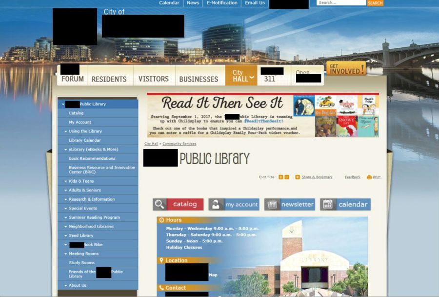
I am currently employed as a Web Services Librarian in a public library, and I frequently am asked, what does a web librarian do, and why did you go to library school for that?
As a web services librarian, I’m basically a user experience professional, but I work specifically for libraries, and I work for one library instead of working in a company assigned to various companies’ projects.
With regards to my degree from library school, if I wanted to keep doing my job in the library world (which I do), I would be required to have one, but it also really prepared me for several key components of my job.
User Experience
So, what is user experience? One professional said, “A user experience, if it’s done well, it’s invisible, right?…by taking these bad experiences away, customers are happy, they come back.” My job is to make my library’s website easy to navigate and search so that the user feels the process is seamless and doesn’t have any problems finding information. This means looking at the organization of content, making sure the website is accessible to people with disabilities, and learning more about the users so I can make sure the website doesn’t do anything the user doesn’t want it to do.
Knowing the Users
One of the things that helps to create a good user experience is knowing our users, which is one of the parts of the job where having a Masters in Library Science (MLS) comes in handy. One of the many things I learned in graduate school was about how many different users interact with the library, and how people interact with websites in general, and their expectations for those interactions.
I also learned about survey design from grad school, since libraries constantly have a need to survey their users, either about their web presence, or about their services in general, or even to find more information about the population they serve. I use surveys in my job to learn more about the users who use the library and what they are most interested in finding at the library and on the website.
Organizing Information aka Information Architecture
One of the major components of library school is learning how to organize information. I don’t just mean cataloging, which is a required course, but studying library science is basically learning how best to organize information, and then do things with it, like teaching it, or deciding what information is worth purchasing, etc. This comes really in handy with library websites, because like all information, information on website needs to be organized too. Creating organic pathways for users to discover the information they seek is a big component of the job and making sure the categories used to group pages are both intuitive and explicit. You want your users to know exactly what you mean when you say, “Visit Us,” so that they hopefully know that they can find your hours and holiday closures in that category, and that they don’t expect to find the organization’s mission statement in that section.
Managing Content
One of the challenges of working on a website within a services profession, and this is especially true of librarians, is that they want to help. What this means is that they frequently have the urge to include all information that may be useful on the website, just in case the user wants it. However, there’s a point at which there’s just too much information, and the user can’t find it, or it becomes too overwhelming to process, and neither of those are good scenarios for the user’s experience. One of my jobs is to step in and talk to the librarians and get them to think realistically about what are the most important, and most needed things the users need on the website, and what are things they might need occasionally, and won’t have a problem contacting a librarian to obtain.
User Testing
Another aspect of my job is user testing. In this case, we are completely overhauling our current website, so before we unveil the new website, we want to do significant user testing. We especially want to make sure that we haven’t created any problems with people who have disabilities, as well as users who aren’t as savvy with technology, or any other group of users who come to our website. The more people who test out the website and can tell us what they think, the better that is for us. But, when we do this, I have to keep in mind that we cannot please everyone. We will never be able to make the website 100% perfect for everyone, so I have to take each suggestion with a grain of salt, and that can be hard to do. It can be really hard to decide what is an actual problem, and what is a minor inconvenience or something that’s just unexpected as users adjust to a drastically different website. While I might have been able to learn about this through another program, I was able to learn about user testing though library school, which gave me a good foundation to learn about how to create usability tests, as well as those judgement calls on user suggestions.
This is not at all an exhaustive list of things that I do in my job, or that other people with similar jobs do, but it represents some of the bigger items that I have to grapple with, and how library school prepared me for them.


