
Welcome to my Hall of Shame series. One of the many things I work on as a librarian is websites, more specifically, the usability, accessibility, and navigation of a website. In this series I will show examples of website sins libraries commit, and explain why they’re not good ideas. In all of my examples, the names of the libraries, and any other identifying information, will be blacked out to protect those guilty of these sins.
This time we’re talking about having a navigational item on your library’s website called “Quick Links.” Below are three examples of library websites that use the term” Quick Links” as a navigational item. These are by no means the only libraries that do it, so if your library is guilty of this, listen up.

First, let’s start with the term “Quick Links.” It’s extremely vague, and it provides the user with no idea of what to expect in that navigational category.

Unlike “Find a branch,” or “Research,” the user has to hover over or click on this category to see what goodies lie behind that door. Also, all links are quick, so calling them “quick links” makes it seem as though the other links in your navigational menu somehow aren’t quick, which isn’t the impression you want to leave with your users.

When libraries use the term “quick links,” they often mean, “this will provide you with quick access to the most frequently used links.” While that’s a noble idea, it defeats the purpose of your navigational structure. The navigational menu your library uses should already have the most frequently used links, and they should be in well sorted categories, so that a user will instinctively know where to go to find this information. If you already have the same links in your navigation, there’s no need to duplicate it. Once should be enough. Your content should have a strong “information scent.” Iain Barker, a usability and information architect specialist says, an
“Information scent is a term used to describe how people evaluate the options they have when they are looking for information on a site. When presented with a list of options users will choose the option that gives them the clearest indication (or strongest scent) that it will step them closer to the information they require.”
Think of your user as an ant for a second. If there are strong food scents, an ant (and his friends) will be able to find the food without much difficulty. Similarly, if a user gets a strong information scent, they will have little difficulty finding their content.
For example, one of the aforementioned sinners, has the library hours listed under quick links. However, if your navigation is well organized and thought out, users will know where to go. For example, the Salt Lake City Public Library does a good job of this:

In this navigational structure, it’s clear the hours will be under “About” and then in “Locations and Contact.” It takes remarkably little time for the user to identify where to find this item s/he is looking for.
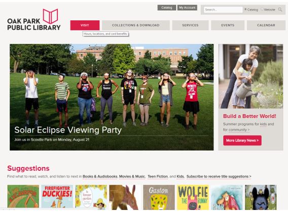
On the Oak Park Public Library site, it doesn’t take a user too long to realize that branch hours will be located under “Visit.”
In addition to what I mentioned above, an article on the Nielsen Norman Group, (a highly respected user experience research, training and consulting company), said this about quick links, “One issue surrounds deriving a concise term that describes the different types of content. It is nearly impossible to do.” Likely the content included in quick links is a variety of information. It could include popular content, content that’s hard to find, or important databases, and therefore, it makes it hard to provide a descriptive name for this category that contains a little bit of everything. Furthermore, since “quick links” is such a vague term, and as such, determining the content within that category is relatively arbitrary, it’s hard for a user to know if a popular link would be included in that category or not. Maybe library events would be in that category, but then again, maybe not.
Summary and Solution: “Quick Links” is an ill-defined category, with a vague name, and relatively arbitrary rules. If the links in that section already exist in the navigation, there’s no need to duplicate them. Trust that you have structured your navigation correctly, following usability and user experience principles. If those links aren’t in your navigation, they should be. You might need to re-categorize your navigation and think about how your user would approach the page, but it’s worth it. The result will be a website where users can easily find what they want, without getting frustrated at the website (or your library).
References:
- Barker, Iain. “Information scent: helping people find the content they want.” Step Two, 2 Aug. 2005, http://www.steptwo.com.au/papers/kmc_informationscent/. Accessed 9 Aug. 2017.
- Pernice, Kara. “Quicklinks is a vague term and an inconsistently helpful feature on intranets.” Nielsen Norman Group, Nielsen Norman Group, 1 Sept. 2014, http://www.nngroup.com/articles/quicklinks-label-intranet/. Accessed 9 Aug. 2017.
