
This is a continuation of my Hall of Shame series. One of the many things I work on as a librarian is websites, more specifically, the usability, accessibility, and navigation of a website. In this series I will show examples of website sins libraries commit, and explain why they’re not good ideas. In all of my examples, the names of the libraries, and any other identifying information, will be blacked out to protect those guilty of these sins.
Before I go into this month’s post, I want to say this disclaimer: The issues I’m pointing out are very relevant, and should be rectified if there is a chance to do so. I don’t claim to know the budgets of these libraries or the reasoning behind their decisions, so I can only go off what I see on their websites.
With that disclaimer out of the way, let’s begin. This post is about libraries that don’t have their own website. Their website is folded into the university or city’s own websites. Below, are three big reasons why that is problematic, with screenshots of library websites to back up the evidence.
Problem one: Too many navigational menus, and confusion on which menu does what
This public library is in a large metropolitan area. It’s not a city library itself, but it’s an adjacent town with a substantial population.
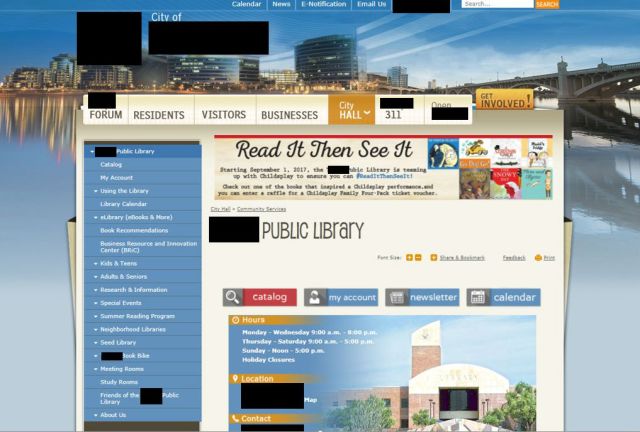
As you can see, there are a lot of navigational menus here. Below, I’ve pointed them out. Only the darker arrows are the menus that belong to the library.
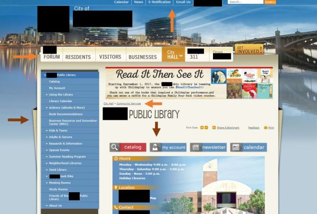
That’s two out of five navigational menus, and that’s just “above the fold!” There’s just a lot for the eye to look at, and it can be a little confusing for users to figure out which navigation is the appropriate one for their needs. That can be true with two competing navigations, and it’s certainly true with five. The navigation menu up at the very top is vague enough that a user could confuse that for the library’s navigation, and look for upcoming events, or try to contact the library that way.
Problem two: The library doesn’t have its own search; users can’t search your website without searching everything else too
Here is another public library whose website is a part of their city’s website. This city is pretty large, and also in a large metropolitan area. This city isn’t adjacent to the large city like the previous website’s city is, but it’s very close.
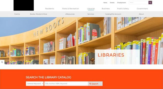
So the above library has a less cluttered design than the previous website, and the navigation is a bit clearer, but it still leaves you with a search problem. On this website a user can easily search the catalog without a problem, but if they want to search the library website, their only option is to search the whole city’s site too. This can cause problems for many reasons. Even if you have a good search appliance, there are bound to be results from other departments that show up because everything is all mixed in. Even if the search is doing a pretty good job of pointing people to the right department and page, there will be problems. As each department adds and edits pages, they don’t necessarily think about the metadata, and how that will affect the search when a user searches for “borrowing” and gets results on the limits of borrowing power, as evidenced below.

Problem three: Your content doesn’t has as much room to spread out, and you’re stuck with the template of your parent organization
This problem is related to problem number one. Since the library must operate within the boundaries of the city or school’s already designed website, there’s only so much space that can be used for the library.
The below library is an academic library in a large city. As you can see, these issues are problems in both academic and public libraries.
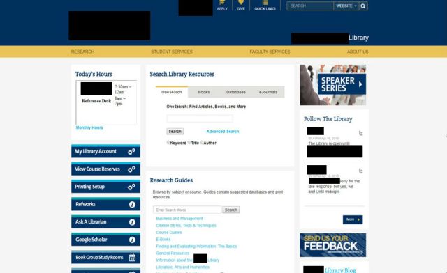
The in screenshot above, the school’s navigation menu sits at the top, and there is substantial blank space on both the left and right side. In the middle is the library content, which is a bit cramped, space wise. If the library could use the blank space on the sides, and spread the content out, then the website would look substantially better; much less cluttered. As it currently exits, it is not as cluttered as it could be; there is a lot of white space. However, there isn’t a lot of space in between the three columns of content they have, and it appears as though that’s due to the template this school uses for its website. I went through this school’s site, and I noticed that other pages also have blank sides. That look works well visually, for a page for the department of biology. But a library homepage needs to convey more information than that, so not having that space to move around makes everything look more cramped than it needs to be.
This goes for the school’s navigation too. It would be great if the library could utilize some of that upward space and just stretch out a bit, but instead the library content is sitting there, cramped in a car that’s trying to fit too many things, with no room to breathe.
Furthermore, as a part of keeping with your organization’s template, you’re stuck with their design choices, even if they aren’t great. For instance, below is a photo of a library website that is a part of a branch campus of a larger state university system.

In the second navigational menu from the top (the one with the black backdrop), you can see that the text is a little tricky to read. Now, this passes AA color-contrast standards (not AAA), but it is a little hard for me to read, and my point here is that, this library is stuck with something that is hard to read on its pages. This isn’t the end of the world, but it doesn’t look great for libraries in general when patrons have trouble with any aspect of their website, whether they have control over it or not. Getting your own website, and being able to have that control can go a long way toward getting some goodwill from your patrons.
Summary:
There are many reasons for a library to have its own website, but here are three big ones: You don’t have extra navigational menus, a search on the website searches the library, and nothing else, and you have more control over your design and layout, and can choose the formats that work best for your content. All of these problems can be a major point of frustration and confusion among patrons, so reducing these problem points can greatly improve the experience your user has when interacting with the library virtually.
