Visual of a springshare calendar on an academic library website with the no coffee Achromatopsia filter applied

Library Websites’ Hall of Shame: Color Blindness

This is a continuation of my Hall of Shame series, where I point out website “crimes” that many libraries are guilty of committing. If you missed my first post in this series, you can see it here: Hall of Shame series.

This time, I’m coming for those libraries (and other institutions) who don’t test their website to see if it works for people who are color blind.

Color blindness affects approximately 8% of all men, and 0.05% of women (National Eye Institute). This means out of the approximately 300 million people in the United States (doing the math myself) they may be as many as 12 million men and about 7.5 million women in the United States with some form of color blindness, which is a total around 19.5 million.

So, with all of these people who are color blind, what can we do to improve their experience on websites?

Continue reading “Library Websites’ Hall of Shame: Color Blindness”

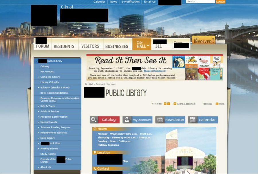
photo of a public library website within a city library's website

What Not to Do on Your Library Website, or the Library Websites’ Hall of Shame: Not Having Your Own Website

This is a continuation of my Hall of Shame series. One of the many things I work on as a librarian is websites, more specifically, the usability, accessibility, and navigation of a website. In this series I will show examples of website sins libraries commit, and explain why they’re not good ideas. In all of my examples, the names of the libraries, and any other identifying information, will be blacked out to protect those guilty of these sins.

Before I go into this month’s post, I want to say this disclaimer: The issues I’m pointing out are very relevant, and should be rectified if there is a chance to do so. I don’t claim to know the budgets of these libraries or the reasoning behind their decisions, so I can only go off what I see on their websites.

With that disclaimer out of the way, let’s begin. This post is about libraries that don’t have their own website. Their website is folded into the university or city’s own websites. Below, are three big reasons why that is problematic, with screenshots of library websites to back up the evidence.

Continue reading “What Not to Do on Your Library Website, or the Library Websites’ Hall of Shame: Not Having Your Own Website”

What Not to Do on Your Library Website, or the Library Websites’ Hall of Shame: Quick Links

Welcome to my Hall of Shame series. One of the many things I work on as a librarian is websites, more specifically, the usability, accessibility, and navigation of a website. In this series I will show examples of website sins libraries commit, and explain why they’re not good ideas. In all of my examples, the names of the libraries, and any other identifying information, will be blacked out to protect those guilty of these sins.

This time we’re talking about having a navigational item on your library’s website called “Quick Links.” Below are three examples of library websites that use the term” Quick Links” as a navigational item. These are by no means the only libraries that do it, so if your library is guilty of this, listen up.

A large urban public library with their Quick Links menu item circled
A large urban public library

Continue reading “What Not to Do on Your Library Website, or the Library Websites’ Hall of Shame: Quick Links”