Tl:dr: When adding headshots of people to a public website, you should allow them to choose what information is in the alt text of their photo.
In my last post, I discussed writing alternative (alt) text for headshots and how much to describe someone. If you haven’t read it yet, I would recommend reading it before continuing this post.
In the post, I advocated for using skin color descriptors when making alt text. However, between when I wrote that and now, I have learned that Google will index the alt text of photos and display them as preview text in search results.
For example, at my work, there was a person who identified as a black woman, and our alt text for her headshot reflected this information. But when someone searched Google with her name, the alt text came up as the preview text for the page.
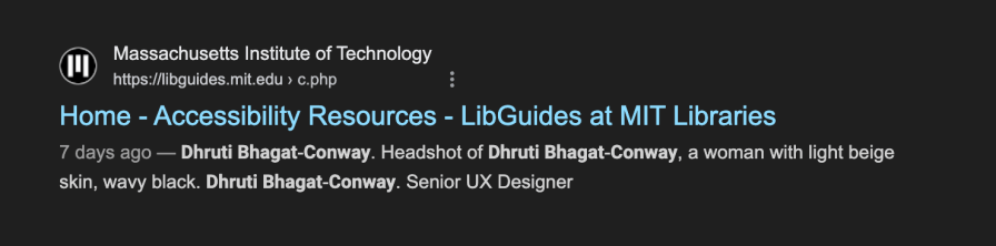
The same thing happens when you search for my name. Under the link in the Google results, in the preview text, it says, “Headshot of Dhruti Bhagat-Conway, a woman with light beige skin…”

This information isn’t inaccurate, but it may not be what everyone wants to have displayed when someone searches for their name.
My new policy is to ask the person how much information they would like included in their headshot, considering that Google and other search engines may display it.
So far, most people just choose “Headshot of Dhruti Bhagat-Conway.” Some are willing to include their gender in the alt text, so it would be something like “Headshot of Dhruti Bhagat-Conway, a woman.”
Here are the examples I’ve shared with people to give them an idea of their choices:
- Headshot of Jamie Williams (this is the standard alt text we use for everyone who does not give us more descriptive alt text)
- Headshot of Kayla Jones, a Hispanic non-binary person with curly black hair and glasses
- Headshot of Leslie Smith, a White middle-aged male with shoulder-length straight green hair
- Headshot of Alex Wilson, Head of Marketing, and a young Black female with a piercing through their left eyebrow
- Headshot of Ember Jackson, a non-binary older adult
This mainly applies when adding headshots of current people to a public website. On your own intranet, for example, this will not be an issue. Additionally, if you are describing old photographs, this is also not a concern.
I stand by what I said in my previous post. I believe skin color descriptions are very important, and they should be included in alt text. But, as much as I want that to happen, people should have control over what language is publicly available about them.