
So my fiancé is a PhD student. That fact is only relevant in that it’s my main source of information about processes at various academic institutions. While he is a student and works for only one university, he is on projects with other universities, and regularly reviews papers for journals.
There are times he shows me or tells me about websites, surveys, graphs, or practices that clearly violate current accessibility standards. At times he has mentioned this to the people in charge of these items and he frequently gets the response along the lines of “I don’t think people with visual impairments will use this.”
As someone who strives to ensure accessibility practices are followed, this response makes me frustrated. But, rather than having this be a series with me venting about these transgressions, I’d like to take this time to give a brief overview on how academic faculty and staff (or other researchers) can build accessibility practices into their workflow and why they should.
This series is going to focus on a few main problems with accessibility in academic research, but by no means are they they only ones. If you’re curious about other accessibility considerations, take a look at Anne Gibson’s Alphabet of Accessibility on the Pastry Box Project; it’s fantastic.
Color usage in research graphs/charts
Most people experience normal color vision. Most people tend to create images that are visually distinct to them. If they can tell the difference between two colors on a graph or chart, they believe their audience will be able to as well.
However, color blindness affects about 1 in 12 men and 1 in 200 females. There are an estimated 300 million people worldwide that experience some type of color blindness. This means that there’s a high likelihood that someone you have met or know has some form of color blindness.
The most common type of color blindness is red or green color blindness. However, there are other forms of color blindness, including blue deficiency and total color agnosia (everything appears as shades of grey).
All color blindness can vary in its severity, and isn’t limited only to the deficient colors. Colors with red, blue, or green in them can be difficult to discern as well. For instance, purple is comprised of varying shades of blue and red. When you take away the red from your vision, blue and purple can look very similar.
Lots of scholarly research includes graphs and charts to represent data and results. However, depending on your color scheme, and how you’ve set up your chart, it may not be readable by everyone.
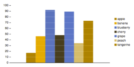
Example of a Bad Graph


How to Fix the Problem
I will mention that the legend in the above graph does list the items in the order they appear, but that’s not always possible in graphs, nor is it always how it is done. So, what can we do to adjust these graphs to make them more color blind friendly?
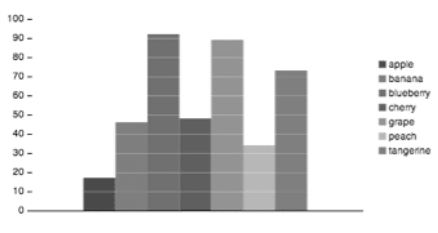
- Vary the hues/saturation of the graph colors so they appear different to users with monochromacy. For instance, in the full-color graph above, you can see that the color for peaches is much lighter than the color for tangerines. In the monochromacy graph below it, you can see that the two bars on the right of the graph have different levels of white and black. The peach displays as a much lighter grey than the tangerine, making it visually distinct.
2. Use patterns in data visualization to convey the different data sets. The below image shows an example of a graph that uses patterns to convey the differences, so that color isn’t the distinguishing factor. Regardless of the colors a user can see, they will all be able to pick up on the different patterns and will be able to easily differentiate them.

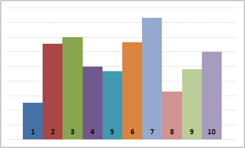
3. Don’t rely on color/legends alone to identify the data; use labels. Many graphs use a color legend to help viewers identify what the different parts of the graph represent. However, for users with color deficiencies it can be difficult to see and identify the colors in the legend, and on the graph. Adding in labels to the different data sections avoids that problem neatly. It clearly labels what the viewer is looking at (if they don’t need alt text-that’s a separate post). The graph below demonstrates using labels to identify the different data.
Resources
So, how can you easily incorporate this into your workflow? Chrome has several plugins that mimic what different types of color blindness look like, so that you can inspect your work as you go. I recommend the Chromacy Chrome plugin to check your work online.
If you want something that will show you what it looks like on work you’re doing on any software you have on your computer, you can download Color Oracle (free) to use on your computer. It is compatible with both Mac and Windows computers.
If you’re creating work in JupyterLab, my fiancé developed a plugin to help you check for color blindness problems in the software. Neither he nor I gets any kind of compensation from you using this. You can see how to use it in this GIF below.

For help figuring out which colors to use (if you aren’t using patterns or labels), you can use ColorBrewer to find compatible colors. While this website helps generate colors for maps, you can use the same colors on something else once they’ve generated it; just please credit them for it. At the top, just select the number of data classes you have, and it will generate a palate for you (max is 12).
These are by no means the only tools you can use, just some of them. I hope you’re able to use them in your work to make your research more accessible!
